Showing posts with label Writing (Part 1). Show all posts

Sunday, April 22, 2018

The IELTS Academic Task 1 Writing


The Introduction
You don't need much here. You only have 150 words to fully answer the question and this is not much. So, you need 1 or 2 sentences describing the following:
The type(s) of graph you are describing
The titles of the graph(s)
The date of the graph(s)
The scale (see the paragraph above)

You might not have all this information but you should report what you do have. So, for example, your beginning could look like this:
In this report I am going to describe 2 graphs. The first one is a bar chart showing the relationship between age and crime and the second is a pie chart showing the types of reported crime in the UK in 2002.
Describing Graphs for The IELTS Academic Task 1 Writing

What you need to do here is factually describe the graphs. You don't need to analyse the data, For example you don't need to give reasons for why figures are high or low. Sometimes, when there is more than 1 graph, there is a relationship between the two and you can bring in some comparison but more than this is not necessary. In the same way, no specialised knowledge of your own is needed or wanted nor your opinions.
Remember the function of many graphs is to describe a trend so be sure that you describe the trends. A trend is how values change generally over time and it is important to describe the changes along with some of the individual values. We will look at trends a bit later under line graphs.
One important issue with The IELTS Academic Task 1 Writing is how much detail to include in your report. This depends really on how much detail there is in the question. If there is only 1 graph and it doesn't have much numerical data in it, then you will be expected to include all or nearly all of the numerical detail. If, however, you have 2 graphs, both of which are very complicated with lots of values, you will not be expected to include everything as you only have 150 words to do the job. What you will have to do is to include a selection of what you feel is the most important and significant detail that needs to be included to accurately describe the graph. With practice from good IELTS practice tests, you will improve at including all the necessary detail with the right amount of words.
You must always have some numerical detail though.
Now let's look individually at the types of graph that you are likely to meet in the exam and how to describe them.
Bar Charts for The IELTS Academic Task 1 Writing
Hopefully you will have described the title of the bar chart in your introduction so you can go straight into the description. Basically, with a bar chart, you need to describe the bars and their values. When describing a bar chart you first have to decide in what order to describe the bars, highest value to lowest value or lowest value to highest value. It may be a mixture of this. If there are very many bars, you can sometimes group together for description 1 or 2 or 3 bars which have similar or the same values. If there are very many and you can't group them, then just describe the ones that are the most significant.
Pie Charts for The IELTS Academic Task 1 Writing
Pie charts are relatively straightforward as they only usually have a few sections though this is not always the case. You need to describe the segments and their values. If there are very many then just describe the ones that are the most significant. The values are often expressed in percentages but not always so be careful what scale you are using.
Tables for The IELTS Academic Task 1 Writing
These can sometimes be tricky as they provide a lot of information and it is often awkward and difficult to describe every piece of information. You have to decide and describe the values and sections that are the most significant.
Line Graphs for The IELTS Academic Task 1 Writing
The function of a line graph is to describe a TREND pictorially. You therefore should try and describe the trend in it. If there are many lines in the graph(s), then just generally describe the trend. If there is only one or two, then use more detail. So, describe the movement of the line(s) of the graph giving numerical detail at the important points of the line.
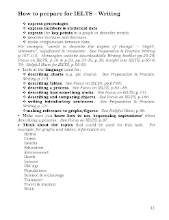
To describe the movement, there is some language which will always be useful. Below is a list of language you can use. Check with your dictionary words that you don't understand and practice using the words/phrases so you use them in the right way. As you will see, there are a number of words which are similar in meaning. This means that you will be able to use a variety of vocabulary which gives a good impression to the examiner who will read and mark your writing. The words below are particularly useful for line graphs but they can also be used where appropriate to describe the other types of graph.
Expressing the Movement of a Line

Rise (to), a rise, Increase (to), an increase, Go up to

Grow (to), growth, Climb (to), a climb, Boom, a boom, Peak (at), (reach) a peak (at)
  
Fall (to), a fall (of), Decline (to), a decline (of), Decrease (to), a decrease (of), Dip (to), a dip (of), Drop (to), a drop (of), Go down (to)

Reduce (to), a reduction (of), A slump
Level out, a leveling out, No change, no change, Remain stable (at), Remain steady (at), Stay (at), Stay constant (at), Maintain the same level

Dramatic
dramatically
Sharp
sharply
Huge
hugely
Enormous
enormously
Steep
steeply
Substantial
substantially
Considerable
considerably
Significant
significantly
Marked
markedly
Moderate
moderately
Slight
slightly
Small
Minimal
minimally


Describing the Speed of a Change

Rapid
rapidly
Quick
quickly
Swift
swiftly
Sudden
suddenly
Steady
steadily
Gradual
gradually
Slow
slowly


Describing a Process for the IELTS Academic Task 1 Writing

We have looked at the various types of graph that you might be asked to describe but you also might have to describe a diagram representing a process.

First of all, the introduction and the ending should be more or less the same.
Then, work out the various stages of the process. Take each one separately (it's only probably going to have a limited number of stages) and describe them fully. Fully is the important word as reaching the word limit has proved harder in this task. If you have this problem, don't be afraid to use your imagination to add to detail about the process.
Other Hints for the IELTS Academic Task 1 Writing

DON'T copy any part of the question in your answer. This is not your own work and therefore will be disregarded by the examiner and deducted from the word count. You can use individual words but be careful of using long "chunks" of the question text.
Don't repeat yourself or the same ideas. This gives a bad impression and the examiner realises that it isn't adding to the content of your report.
If you are weak at English grammar, try to use short sentences. This allows you to control the grammar and the meaning of your writing much more easily and contributes to a better cohesion and coherence mark. It's much easier to make things clear in a foreign language if you keep your sentences short!
Think about the tenses of your verbs. If you're writing about something that happened in the past, your verbs will need to be in the past tenses. If you're describing the future, you will need to use the future tenses. If it's a habitual action, you'll need the present simple tense and so on. If you have time, a quick check of your verbs at the end of the exam can help you find errors. For describing graphs you will probably need past tenses whereas, for describing a process, you will probably need the present simple. Think about the verbs while practising and then it will become easier when you do the exam.

Don't be irrelevant. Although you can use your imagination to expand on your answer, if any part of your report is totally unrelated to the question and put in to just put up the word count, then the examiner will not take it into account and deduct it from the word count.

Friday, March 30, 2018

Assessment criteria

Versions of the assessment criteria for Writing and Speaking have been developed to help stakeholders better understand the level of performance required to secure a particular band score:

Downloads

Taken from:
https://takeielts.britishcouncil.org/find-out-about-results/ielts-assessment-criteria

Also visit this page to calculate your score more accurately:

Tuesday, September 30, 2014

Writing Part 1

This line graph demonstrates the amount of goods conveyed carried to their destination via four different ways means of transport in the United Kingdom between 1974 and 2002, as indicated in the x-axis. The y-axis quantifies the millions of tonnes of commodities transported by four different types of transport, According to the legend, the four different modes of transport through four media which are the road, water, rail and pipeline. 

(the last is illustrated by a solid line, road is demonstrated by a segmented line and the others are shown by dotted and semi-doted lines.) —-> unnecessary

It can be seen from the graph that goods which were transported on boats and trains were about 40 million tonnes in 1974 and stayed there remained as such until 1978. Interestingly, goods transported on water surpassed those which conveyed on sent by rail and gradually rose to 65 million tones in 2002, while at the same time goods transported on rail were almost 20 million less. As can be seen in the graph, commodities transported were 70 million tonnes in 1974, while those which transported in pipeline transports were about 5 million tonnes. Surprisingly, road transferred goods gradually rose until 1994 and from this year to 2002 they increased sharply and reached 100 million tonnes. On the other hand, those products which carried by pipelines moderately grew to 20 million tonnes in 2002. 


It is clearly illustrated from the graph that the largest proportion in transported goods in the United Kingdom took place on roads, while the pipelines were the least preferred medium last. The basic conclusion to be drawn is the flourish in the shipping industry steadily flourished ,which surpassing both pipeline and rail transportation, but stayed below road transported goods all the way through.

Tuesday, June 17, 2014

Writing Part 1: Cement and concrete production (describing a process)

The two diagrams clearly show all the materials and the processes, for the creation of cement and concrete.
                Cement production begins when we place limestone and clay into the crusher, in order to produce powder. Subsequently, powder is placed into a mixer and falls through a rotating heater. Inside this pipe (heater) it melts (no commas here) and after that it is ground in order to become cement and finally be packed in bags.
                According to the concrete production diagram, a wide variety of ingredients are required for this process. More specifically, a modicum amount of water is needed, around 10%, and approximately 15% of cement. Finally, (comma) mixing the above materials with an enormous amount of gravel (which amounts to/ constitutes 50% of the final product), and a medium quantity of sand, at 25%, into a concrete mixer, which rotates clockwise, completes the final part/ stage of concrete production.
                Taking everything into account, both processes seem to be excessively time consuming. (This conclusion cannot be drawn based on the diagrams/ no exact time is included) Additionally, the concrete-making process demands twice the materials than the cement production process.

Monday, June 16, 2014

Writing Task 1: tips

The IELTS Academic Task 1 Writing

The Introduction

You don't need much here. You only have 150 words to fully answer the question and this is not much. So, you need 1 or 2 sentences describing the following:
The type(s) of graph you are describing
The titles of the graph(s)
The date of the graph(s)
The scale (see the paragraph above)

You might not have all this information but you should report what you do have. So, for example, your beginning could look like this:

In this report I am going to describe 2 graphs. The first one is a bar chart showing the relationship between age and crime and the second is a pie chart showing the types of reported crime in the UK in 2002.

Describing Graphs for The IELTS Academic Task 1 Writing

What you need to do here is factually describe the graphs. You don't need to analyse the data, For example you don't need to give reasons for why figures are high or low. Sometimes, when there is more than 1 graph, there is a relationship between the two and you can bring in some comparison but more than this is not necessary. In the same way, no specialised knowledge of your own is needed or wanted nor your opinions.

Remember the function of many graphs is to describe a trend so be sure that you describe the trends. A trend is how values change generally over time and it is important to describe the changes along with some of the individual values. We will look at trends a bit later under line graphs.

One important issue with The IELTS Academic Task 1 Writing is how much detail to include in your report. This depends really on how much detail there is in the question. If there is only 1 graph and it doesn't have much numerical data in it, then you will be expected to include all or nearly all of the numerical detail. If, however, you have 2 graphs, both of which are very complicated with lots of values, you will not be expected to include everything as you only have 150 words to do the job. What you will have to do is to include a selection of what you feel is the most important and significant detail that needs to be included to accurately describe the graph. With practice from good IELTS practice tests, you will improve at including all the necessary detail with the right amount of words.
You must always have some numerical detail though.

Now let's look individually at the types of graph that you are likely to meet in the exam and how to describe them.

Bar Charts for The IELTS Academic Task 1 Writing

Hopefully you will have described the title of the bar chart in your introduction so you can go straight into the description. Basically, with a bar chart, you need to describe the bars and their values. When describing a bar chart you first have to decide in what order to describe the bars, highest value to lowest value or lowest value to highest value. It may be a mixture of this. If there are very many bars, you can sometimes group together for description 1 or 2 or 3 bars which have similar or the same values. If there are very many and you can't group them, then just describe the ones that are the most significant.

Pie Charts for The IELTS Academic Task 1 Writing

Pie charts are relatively straightforward as they only usually have a few sections though this is not always the case. You need to describe the segments and their values. If there are very many then just describe the ones that are the most significant. The values are often expressed in percentages but not always so be careful what scale you are using.

Tables for The IELTS Academic Task 1 Writing

These can sometimes be tricky as they provide a lot of information and it is often awkward and difficult to describe every piece of information. You have to decide and describe the values and sections that are the most significant.

Line Graphs for The IELTS Academic Task 1 Writing

The function of a line graph is to describe a TREND pictorially. You therefore should try and describe the trend in it. If there are many lines in the graph(s), then just generally describe the trend. If there is only one or two, then use more detail. So, describe the movement of the line(s) of the graph giving numerical detail at the important points of the line.

To describe the movement, there is some language which will always be useful. Below is a list of language you can use. Check with your dictionary words that you don't understand and practice using the words/phrases so you use them in the right way. As you will see, there are a number of words which are similar in meaning. This means that you will be able to use a variety of vocabulary which gives a good impression to the examiner who will read and mark your writing. The words below are particularly useful for line graphs but they can also be used where appropriate to describe the other types of graph.

Expressing the Movement of a Line
 
Rise (to), a rise, Increase (to), an increase, Go up to
 
Grow (to), growth, Climb (to), a climb, Boom, a boom, Peak (at), (reach) a peak (at)
  
Fall (to), a fall (of), Decline (to), a decline (of), Decrease (to), a decrease (of), Dip (to), a dip (of), Drop (to), a drop (of), Go down (to)
 
Reduce (to), a reduction (of), A slump
Level out, a leveling out, No change, no change, Remain stable (at), Remain steady (at), Stay (at), Stay constant (at), Maintain the same level

Dramatic
dramatically
Sharp
sharply
Huge
hugely
Enormous
enormously
Steep
steeply
Substantial
substantially
Considerable
considerably
Significant
significantly
Marked
markedly
Moderate
moderately
Slight
slightly
Small
Minimal
minimally
 
 
Describing the Speed of a Change
 
Rapid
rapidly
Quick
quickly
Swift
swiftly
Sudden
suddenly
Steady
steadily
Gradual
gradually
Slow
slowly


Describing a Process for the IELTS Academic Task 1 Writing

We have looked at the various types of graph that you might be asked to describe but you also might have to describe a diagram representing a process.

First of all, the introduction and the ending should be more or less the same.
Then, work out the various stages of the process. Take each one separately (it's only probably going to have a limited number of stages) and describe them fully. Fully is the important word as reaching the word limit has proved harder in this task. If you have this problem, don't be afraid to use your imagination to add to detail about the process.
Other Hints for the IELTS Academic Task 1 Writing

DON'T copy any part of the question in your answer. This is not your own work and therefore will be disregarded by the examiner and deducted from the word count. You can use individual words but be careful of using long "chunks" of the question text.
Don't repeat yourself or the same ideas. This gives a bad impression and the examiner realises that it isn't adding to the content of your report.
If you are weak at English grammar, try to use short sentences. This allows you to control the grammar and the meaning of your writing much more easily and contributes to a better cohesion and coherence mark. It's much easier to make things clear in a foreign language if you keep your sentences short!
Think about the tenses of your verbs. If you're writing about something that happened in the past, your verbs will need to be in the past tenses. If you're describing the future, you will need to use the future tenses. If it's a habitual action, you'll need the present simple tense and so on. If you have time, a quick check of your verbs at the end of the exam can help you find errors. For describing graphs you will probably need past tenses whereas, for describing a process, you will probably need the present simple. Think about the verbs while practising and then it will become easier when you do the exam.
Don't be irrelevant. Although you can use your imagination to expand on your answer, if any part of your report is totally unrelated to the question and put in to just put up the word count, then the examiner will not take it into account and deduct it from the word count.

Writing task 1: Land degradation

The charts show the causes which contributed to the diminishing productivity of agricultural land during the 1990s in North America, Europe and Oceania.


As shown in the pie chart, the most harmful cause worldwide is over grazing which covers 35 percent of total causes. As we can see, the second adverse phenomenon is deforestation (by 5 units less--> is this a phrase?) and the last one is over cultivation (why by?) 28 percent of the total (opposing?) effects.


According to the table, European agricultural productivity has been affected in the most significant way. As can be observed (you have overused phrases beginning with as), the total land degraded in Europe is 23 percent, while at the same time it is 13 percent in Oceania and 5 percent in North America.


However, from the table it may be inferred that there is no over cultivation in Oceania, albeit this phenomenon is the third cause of worldwide degradation.

Overall, as we could see in the pie chart, there is a 7 percent of other factors that have not been estimated yet, which contribute to the decreased agricultural productivity. (Why refer back to the pie chart when you have not sufficiently covered the data in the table?)

Friday, June 13, 2014

Writing task 1 (Global land degradation - IELTS)

The pie chart shows the main reasons of global land degradation, while the table, below the pie chart, presents us with the extent the aforementioned phenomenon has affected three regions during 1990s (no apostrophe).

According to the pie chart, (comma) the main cause of global land degradation was overgrazing (no gap necessary), reaching 35% of the total causes. In addition, deforestation was on the same range of levels as overgrazing, around 30%. Last but not least, overcultivation and other causes were the rest 28% and 7% respectively, which renders both of those causes as secondary roots of the problem.

From the data contained in the table, it can be seen that Europe had the highest level of land degradation, around 23%, and that’s mainly due to the fact that its (no apostrophe) influence/ OR better: the destruction by deforestation and over cultivation was significant, reaching 9.8% and 7.7% respectively. However, Oceania possessed the highest percentage of over grazing, at 11.3%, and the lowest percentage of overcultivation which amounted to 0%, while North American land was affected by those two phenomena by 1.5% and 3.3% correspondingly.

Taking everything into account,global land degradation was well distributed (this statement is unclear- do you mean among the 3 countries?), and over the 50% was caused by over grazing and deforestation, whereas there were numerous fluctuations among the regions.

Note: do not just report data; make some more comparisons, as well.
Monday, June 9, 2014

Writing task 1

The charts display s the expenditures that a UK school has on divergent running costs in three total separate years: 1981,1991 and 2001.

First of all, in all three years the greatest disbursement was on instructor salaries. More specifically, comparing the years 1981 and 1991, teacher’s payment rose 10% and reached the 50% of the total outlay; however, in 2001 it decreased by 5%. On the other hand, the cost of worker payments was less than the instructors' ones. In 1981 the former constituted 28% of total spending and it was continuously falling, so in 2001 it was only 15 percent.

Moreover, we can observe that the cost of books had increased in 1991 up to 20 percent and, in 2001, it decreased to nine percent. Nevertheless, furniture and equipment expenditure s follows a total different distribution than books because from 1981 to 1991 it diminished considerably and in 2001 it reached 23 percent, a much bigger rate that 1981. Finally, insurance that has the smallest proportion in the total school spending pie; in 1981 schools paid 2 percent of the total costs for it, while in 1991 it was 3 percent and in 2001 it reached the point of eight percent.

The obvious conclusion to be drawn is that teachers' salaries were the largest cost of the schools and while spending increased for equipment and insurance, money expended on books and worker salaries cost dropped dramatically.